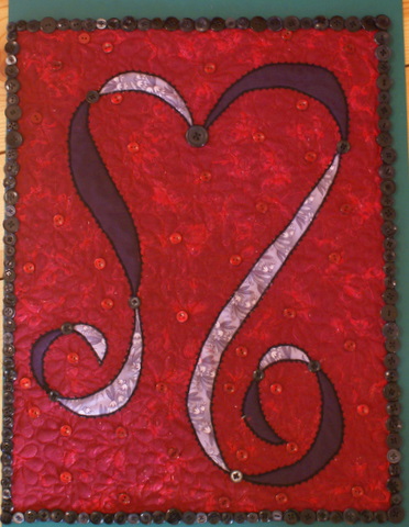
I’ve seen a few bloggers posting pictures of their 2007 Journal Quilts, and thought I’d throw mine out into the universe as well. The big show in Houston has opened, so it’s now “legal” for me to show my quilt off. This was my first year to participate (and it’s the last year of the project). In past years the quilts were 8.5 by 11, this year they changed it up a little bit: they had to be 17 by 22.
I don’t seem to have many any really good looking pictures of it.
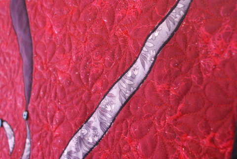
Here’s a closeup of the quilting before I added the buttons and beads.
The background was made with a layer of red wool, over which I sprinkled cut-up bits of an eyelash yarn. The applique pieces were attached to the background and then I put a layer of HOT PINK tulle over the top of the whole piece before I did the satin stitching around the applique and the freehand machine quilting in the background. I emphasize that the tulle was HOT PINK because that was a leap for me! Pink! And Red! Together! It shifted the color of the wool just slightly and added an interesting texture. It’s main purpose was to hold the little bits of sparkly yarn in place.
I edged the ribbon with black seed beads — similar to something I did on one of my other journal quilts that I showed a few weeks ago. I really like how it looks, I just wish I had a picture that showed the detail clearly.
I had a small problem with my iron that involved melting some of the tulle, which necessitated the addition of something to hide the nasty spot — which is why the red buttons got added. Again, you can’t see the detail, but there is also a red seed bed on top of each button.
I love, love, love, the beaded binding. Love it. Love buttons.
The original idea for this quilt actually involved a multi-color background, but it wasn’t working. So, I started over with the red. (When in doubt, go red….). I’m really taken with this heart squiggle of mine. You’ve seen it before, and you’ll likely see it again.
One of the boys wanted to know why my quilt had 2 “S”s on it. And I think it was my husband that said the heart shape looked like cartoon hair.
Pay It Forward: I’ve had one taker so far — doesn’t anybody else want to play along? See yesterday’s post for the details.
TTFN-
Suzanne


I love this – I did see a heart but once you mentioned cartoon hair I kind of see that too. I like how you used the buttons. I really like buttons on quilts but have never used them myself. I think I’ll take the opportunity to experiment some on some of my postcard journal quilts.
Beautiful!
Suzanne – I so happy you’ve decided to play along with the PIF. Please send me your snail mail address when you can. ~ Kim
oooo– yum! I love the texture of the background. Pink and red– deeelish!
So that’s where that came from! It’s all making sense now. I love it! Hope my version will be worthy!
Ooooh. Ahhhh. The bead and button work look strenuous, though.
It was such a fun experience to see this piece up close and in person, as it hung in the Journal Quilt special exhibit in Houston. It’s so much better in person, even though the pictures are pretty good!