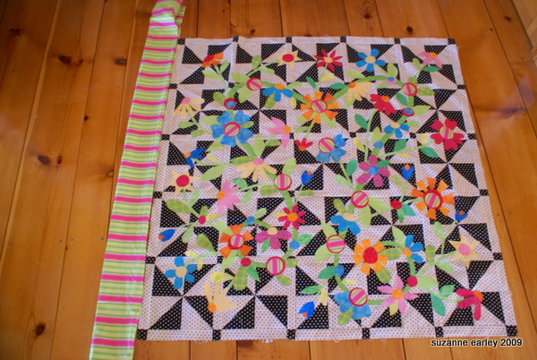
This doesn’t really look any different than prior pictures, however you can tell the flowers have been fused in place.
(Um, you can tell, because it’s no longer sitting on the carpet in the doorway, but has been moved without all of the flowers falling off…)
The pictures aren’t doing it justice. At least, I don’t think they are. I think it looks better in person, but then I worry that just because *I* think so, doesn’t mean it’s actually so.
The striped fabric is auditioning for a frame. I don’t think it’s going to get the part, though. I’m not really sure what it needs. Maybe a frame of the black polka dot fabric? Too bad I don’t have any more of that.
The fusing was done on the floor, righ ton top of the carpet. Don’t tell Mark.
I then took it to my ironing board to finish the job. Several of the pink petals ddn’t want to fuse no matter what. I kept hitting them with the iron and they kept flopping around, held in place only by the flower center on top of them.
Then I realized that when I cut those petals out I apparently grabbed a hunk of the fabric that didn’t actually have fusible on them. Duh.
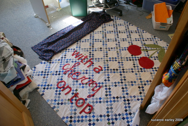
In the last few days I’ve also had an epiphany about how to finish the blue and white Irish Chain I pieced awhile back. In that previous post I talk about having delusions of applique — I could picture appliqueing something, maybe with some words…
You can’t tell from this picture, but that blue fabric over on the left has cherries on it.
The words are just sitting there, because I’m still debating about placement and color.
I liek the idea of having only the word CHERRY in red, but when I put the other words in green, they disappear. I may need to try a darker green? The applique stitching will help, but I still worry it won’t stand out enough.
Anyway, that’s what I’ve been up to.
Oh, that and dealing with freaking Russian pervert spammers who sent over 1000 private messages to members of MQResource yesterday. Good times.
Oh, and a cold. That meant I didn’t sleep a wink last night. It’s going to be a long stinking day.


You are so creative…I like the ideas of putting words on quilts. I’m gonna have to go in my quilt closet and see if I have a quilt top that ‘needs’ words on it. Finding the right words will be tough!
The flowers are cute…love the colors.
I’m really liking all the wordy quilts you’re making lately….may have to try that sometime.
I see all the colors from the striped border (which I recognize from a fat quarter I received) in the quilt but I think it distracts the eye away from the center. I still see the “M”, too.
I love the ‘all red’ writing on the Irish Chain. What a creative addition to that quilt.
I still need help choosing fabrics at the store so everything doesn’t look to wonky…. so with that being said – I think your flower quilt needs a solid stop border – like maybe hot pink, and then a black /black print border. ( but again – consider the source *grin*) .
I love the cherries on the quilt too – you are so inspired!! Keep it up
I think you need a different green. Something more toward the Kelly green or a deep yellow green (there is a Fusion print that would be the perfect color).
Anyway, that is my two cents. I know, 2 cents doesn’t go very far these days :o)
Hugs!
LUV LUV LUV the Cherries on Top – all in RED. And I’ve got a quilt of my own waiting to be quilted that would really benefit from words………so thank you for the inspiration.
I think you could use the striped border fabric if you did a solid skinny border first – maybe the turquoise?
Thanks for taking care of the bad poster. Hope the cold is better.
Neat! You are an impressively productive person.
Cute bright flower quilt. Love the idea you have for the Irish chain quilt. The cherries really bring it to life.
I like the all red lettering on the Cherries On Top quilt….red IS YOUR SIGNATURE COLOR!
You know I am really feeling left out because I didn’t get profane Russian PM. What am I? Chopped liver?
I’m loving the quilts! I really like the second version of Cherry, with the green and red words BUT I worry if there’s enough contrast between the green and the blue. What if you used the red letters under the green, sort of as a shadow. Would that be too busy and look like total crap?
wow, you’ve got some good opinions on this one! For the cherry one I’m thinking you need to have the letters in cherry be bolder, thicker and a darker green for the other letters.
And for the applique quilt I like Alycia’s idea of hot pink and black borders. OR — this could be a great place (IMHO), for the flamingo fabric from the shop!!! (I can just hear you snort at that one).
I love it with the red words and no border at all. The red is so zingy against the softness of the blue and white.
all in red works for me 🙂
Love the Cherry quilt but definitely with all the words in RED!
Love the words with only “cherries” in red. If you use a contrasting thread to applique the green words, I think it will be visible..but still subtle. I like that.
For the first quilt..how about a border with big polka dots?