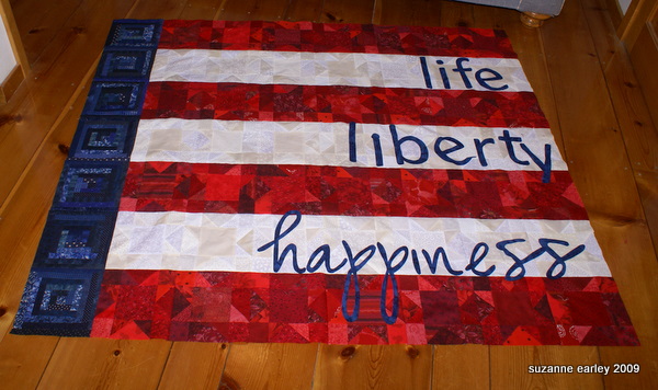
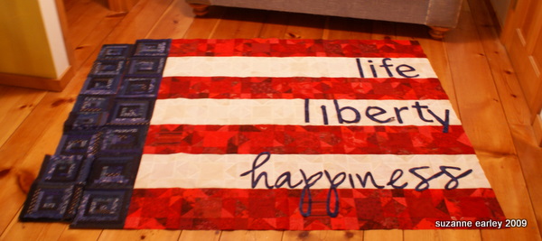
The letters are just sitting in place on the quilt top. Option #3 was the direction I had been envisioning all along. I’m still not entirely sold on the font for “happiness” — but I definitely want it to be a script. I just hope I have enough of the fabric in case I decide to do something else…
The log cabin blocks are stolen from another project that I’m never going to finish.
I had to add some some strips to get them big enough. And now that I’m at this point, I think I want that section to be a row wider.
Luckily I have more log cabin blocks…
Those need additional strips, too, though.
The next trick is to finalize the applique, stitch that, and then quilt it. And then figure out how to finish the edges. If I weren’t going to do it on the longarm, I’d actually do an envelope finish, or whatever you call it. As it is, I think I’ll have to do a facing.
Hmmm, the first thing I’d better go do is stay stitch the outside edges so I don’t pop all those seam allowances open around the edges…
Or maybe I should quit goofing around with new quilts when I have other things to do…


I really like this! Especiallylove what you have done with the pieced red and white blocks. Gonna be a great quilt.
Love this quilt! Very cool indeed.
I’m impressed at how quickly you’ve gotten this together (yes, I know you’re a pro, but still!) and your use of type. Not sure how you did the latter, but it looks difficult.
I like it with the extra row of log cabin blocks. And I agree that “happiness” should look happy. How about Lucida Handwriting or Monotype Corsiva for the word “happiness”?
Or how about that font that you use in this blog, like where it has Recent Blog Posts – that’s a cool font, too and script-like.
what about using the same font for happiness that you’ve used for the other words, but tilt some of them one way, some another way, vary the angles… just a thought. there’s room to stretch them out a bit
No No Keep Goofing – I want to see how it turns out!!
Oh my gosh! It’s absolutely beautiful!!!! Thanks for sharing it. I agree that it needs the extra row, but I like the font that happiness is in, now.