Sharon commented on yesterday’s post that she didn’t care for the writing on Will’s page. Well, I didn’t care for it either, and have been working on tweaking it. Of course, having twins means I had to do a layout of the other boy, too, and in the process, I think I fixed the lettering, and made it better. Maybe.
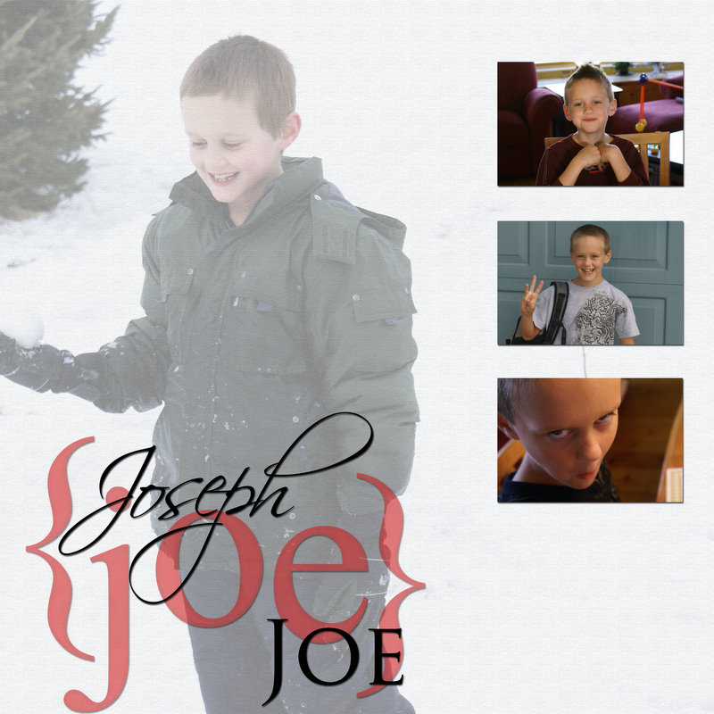

Click to view larger. I’m using thumbnails and linking to a bigger picture for these because I wanted to strike the right balance between the fitting the photos on the page and giving you a big enough photo to see detail.
Almost suppertime….
TTFN-
Suzanne
Edited to add: I just looked at the enlarged pictures and I want to mention that when I look at the layouts, on my computer, and when I print them out, the script writing is smooth and not all jagged like it appears in my browser. Just saying.

Oh wow! These pages are so danged cool! I’m way behind on my reading, so could you take pity and tell me what program you’re using? Like I need another thing to play with!
These are really cool!
Yes, I like this writing much better. I think the white writing was throwing me off. The boys are just precious, by the way. The big photo of Will looks just like you!